How many times have you received brochures and thrown them away into the wastebin? Millions is the answer. Whether it is a bi-fold or a tri-fold brochure design, or any other type of brochure, reaching out to the target audiences is very important.Here is a bag full of solutions for you.
Contents
- 0.1 # Look at the functionality
- 0.2 # Keep it as simple as possible
- 0.3 # Go for variety
- 0.4 # Keep it colourful
- 0.5 # Make graphics work for you
- 0.6 # Choose shapes
- 0.7 # Rounded edges make it warm
- 0.8 # Use texture
- 0.9 # Choose the aptest material
- 0.10 # Keep it small
- 0.11 # Make use of font angle
- 0.12 # Think about the display
- 0.13 # Go for die cuts
- 0.14 # Don’t be scared of changes
- 0.15 # Select accent ages
- 0.16 # Cover it like a case
- 1 Get In Touch With Us
# Look at the functionality
Hiding a simple thing from the normal eye and keeping it as a surprise for the viewers often adds to the functionality of the marketing tool.
# Keep it as simple as possible
Simplicity is the core of any marketing tool. If you approach a professional brochure designer or a company offering brochure design services, you will learn that brochures look best when they are simple.
# Go for variety
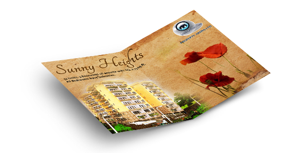
If you think that a brochure is strictly all about a bound back and an attachment at the centre, you are wrong. It can have an accordion shape, gate-shape or any other shape.
# Keep it colourful
You may think that a riot of colours may not be perfect for your marketing tool. In that case you must know that the colour combination depends largely on the topic and the business. A core business brochure would generally not go well, with a tub of hues. It may appear pretty weird, if you do not keep a relationship between the objective of your business and the brochure you are offering. An expert at a brochure design company in India can assist you to make a better decision.
# Make graphics work for you
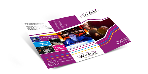
No matter what you showcase and what business you own, graphics can go a long way in describing your message to the audiences. Whether it is a core company offering or an entertainment company, coming up with a series of its latest products, graphics can be of the maximum help.
# Choose shapes
Come on! There is no hard and fast rule of maintaining the same old rectangular shape for the pages of your brochure. After all, you are not making a school exercise book. It is a marketing tool and you are supposed to grab attention, with as much charm as possible. It is better to make sure that the brochure designers use their full-fledged creativity and innovativeness in crafting your brochure. You may ask them to go for circular, diamond-shaped, square or any other shapes for the pages.
# Rounded edges make it warm
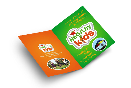
Rounded edges of a brochure bring a soft and warm feeling in the minds of people. In case you are trying to focus on the heritage of your company, what can be better than warm colours ending in rounded edges. It makes the tri-fold brochure design all the more appealing to your target audiences.
# Use texture
Do you own a colour company? Well! You may, as well, try something new. Instead of showing patches of colours or swatches, you may ask the experts to display textural patterns. This is not only innovative, but also gives your business the gaze that you are desiring to achieve.
# Choose the aptest material
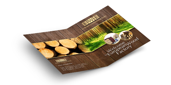
While choosing the material of the brochure, you must look into the offerings you want to promote. If you have a core business to promote, make sure that you use recyclable stuff to give an earthy look to your marketing tool. Adding patches of green to the cover page makes the brochure quite an eye-candy amongst your target audiences.
# Keep it small
Size is always not the last thing. Gone are those days when size did create an impact on the mind of the receiver. These days, matter is more important. You must have seen how your parents go about fussing over the size of gifts they present to people. They forget that size is always not the most important thing to impress people and show them you care. In a similar manner, an expert at a brochure design company in India can tell you that a sizeable brochure is not going to be the last word for creating an impression. A small-sized brochure is not only easy to carry, but also great to store. A person can keep it in his or pocket or wallet owing to its size.

# Make use of font angle
If you are under the impression that a straight font is the ultimate thing to appeal to your audiences, you may be wrong. If you can knock on the diverse perspectives of people in a neat and clean manner, what harm can it do? After all, you will be adding to innovation.
# Think about the display
It is really significant how you arrange for the brochure to be displayed. If you want it to be displayed in a box, make sure that the display box and the tool together make an impact. You may maintain the same theme and see to it that the box completes the brochure design.
# Go for die cuts
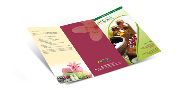
In the event that you are looking forward to a tri-fold brochure design, go for something that creates interest – may be die cuts. They have this unique capability to make people think twice before tossing away the brochure. It makes them feel that there is something inside, which needs to be checked out. One can, therefore, conclude that die cuts work as a great source of attraction for your target audiences.
# Don’t be scared of changes
Opt for a different style, so that you can compel your audiences, with eagerness and interest. A new design idea can be interesting in the event that the young generation can easily be enticed to it. People are no more entangled in the era of practising the same old designs to make sure that they can make an impact. In the world of tough competition, it is worth mentioning that a unique design is much more catchy than sticking to age-old design concepts.
# Select accent ages
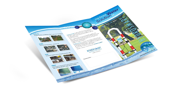
Accent pages do not have images or text on them. But, it is important to note that they can work as die cuts acting as the veil that covers the thing, which lies beneath.
# Cover it like a case
Wow! Is this what you wish your target audiences to say? A cover like a case can not only cover the brochure from outside, but it can also make the marketing tool look personal and warm. Any brochure design India company professional can assist you, in this regard.
Now, that you have noted down the most important factors of a successful brochure design, you may, as well, approach a company offering high-end brochure design India. The experts will help you to come up, with a marketing tool that can reach your business objectives to a wide audience base and make sure that you can succeed in your business, as soon as possible.


 Email:





Thank you my friend for sharing your blog with us. I have read each line of your blog, very informative stuff regarding to broucher designs. Keep your post always like this and dont forget to share with us.
useful information thanks for sharing
This is a great blog which gives understanding about designing a niche brochure. Following these steps one by one, we can surely make an excellent Brochure. I’ll recommend this blog to everyone who is in Brochure Business.
Some genuinely nice and useful info on this site, too I believe the design and style has got fantastic features.
Nice information. And your submitted designs are really awesome and impressive.
Thank you for the appreciation!
I search daily for the good topics to study new something daily, but your content of the article is too good.
I came to your site and have analyzed your post. There are excellent details you posted here. I enjoyed reading your blog, and it is both instructional and enjoyable.
Thank you!