Social– Do you want to create a prominent identity for your organisation? While you have tried a hundred different digital methods, it is time to try out a traditional method you can always bank on. Click on the link to find out how a brochure is one of the most cost-effective ways to catch a reader’s attention and create a brand image.
Table of contents:
- Introduction
- What is a brochure?
- Purpose of a brochure
- Importance of brochure design for brand image
- Key elements of a brochure design
- Importance of a strong message
- Tips for crafting a message that resonates with your brand image
- Examples of brand messaging
- Conclusion
Brand image is much more than a logo that identifies your product, business, or service. Today, it is a combination of associations formed by consumers based on interactions with your company. Around 86% of consumers take a brand’s authenticity into account when making a purchasing decision.
As a marketer or business owner, you might be putting so much effort into providing the best service or product possible. However, the quality of your product is not always the number-one reason why a consumer might make a purchase. Although it’s important, in many cases, it is the brand image that is going to encourage customers to make repeat purchases.
Brand consistency assists your company in developing a loyal and trusting connection between your brand and your target audience. Your marketing brochure design should be consistent with your brand’s colours, language, and design style for effective brand recognition. This is essential for all your branded tools to create a memorable connection with your audience. A good brochure design creates opportunities for your own branding while meeting your print and digital requirements. Keep reading to learn more about the design of a brochure and its purpose.

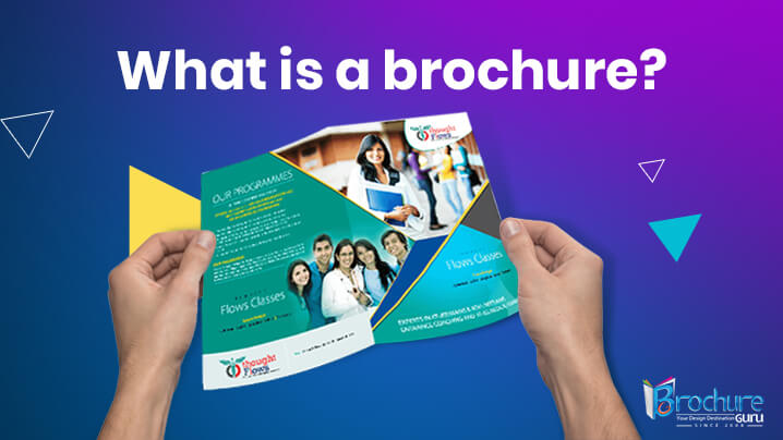
What is a brochure?
Source: https://redballoon.in/why-brochure-designing-is-important/
A brochure is a type of marketing tool that is used to promote a company’s goods or services. Brochures come in distinct types, ranging from a single sheet folded to make sections to the more common multi-page bound booklet. They are usually composed of images supported by text. A brochure can act as a physical representation of the brand, conveying professionalism, trustworthiness, and dependability. It can aid in the establishment of a connection with the target audience and instill confidence, resulting in increased engagement, conversions, and sales.
Purpose of a brochure
Despite the growing popularity of online marketing techniques, the brochure remains an essential part of a company’s marketing structure. These are one of the most crucial pillars of conventional printed marketing, and one of the most cost-effective mediums for establishing your brand, networking your firm, and displaying some creativity that is frequently lost in digital marketing.
Here are some of the popular purposes of a brochure:
- Promotional Product
Brochures positively reflect your company to prospective customers and draw them to your brand name. It is an excellent promotional instrument that helps you stand out from the crowd and aids in increasing company awareness among targeted audiences.
- Provides credibility
A well-designed brochure highlights a company’s objectives, beliefs, and purpose in a credible way. The brochure’s message should be concise, clear, and crisp so that customers can quickly grasp your company and products. Additionally, it is also an excellent way to interact with customers and create more leads, while helping you capture the attention of potential customers.
- Cost-effective
Brochures are typically made of paper, and because paper is a relatively inexpensive material, they are widely used for getting connected to the targeted audiences. It can also be used to tell potential customers about special discounts or sales.
Importance of brochure design for brand image
The digital advertisement has bored and exhausted the viewers. To maintain the contrast, it is critical not to abandon the traditional style entirely. The brochure is an important part of branding because it attracts a lot of customers and serves as a driving force for small companies. There are several other benefits to using brochures in marketing. Let’s go over them one by one in the points below.
- Effective way of representation
Brochures are designed to provide basic information about goods and services. It is critical to remember that it will represent the entire company and any bodies affiliated with it, which is why it must be properly designed. Moreover, as brochures are distributed by hand, they ensure the reader’s attention and reaction.
- Brochures are eye-catching and captivating
These are more effective than newspaper or journal advertisements. When a brochure arrives in hand with colourful pages and a decorative layout, it draws the individual’s attention for a moment. It is a fantastic tool for helping people understand the business and its products. You can make the brochure more useful by using a unique design and artistic depiction. Its goal is to deliver all the information quickly and in a compact way. This helps to avoid boredom and rapidly establish the brand. Furthermore, it is generally recognised by the public, as 90% of people read the brochures to learn more about the company.
- Informative and descriptive
You may have noticed a lack of words or space while marketing through social media networks or other online platforms. This is not the case with brochures, as you can add as many parts as you want while balancing the data and layout. It aids in providing comprehensive knowledge about the product and services. People who want to learn more do not need to go to the website or any other source because the pamphlet contains all the necessary information, making it a beneficial tool for both the businessperson and the consumer.
- Multiple distribution channels
The website is only accessible online, and newspaper and magazine advertisements are only available to a select group of individuals. Brochures, on the other hand, are free to be given to anyone from locations such as malls, exhibitions, events, kiosks, bulletin boards, in presentation folders, or with newspapers. It creates a massive opportunity for proper business branding, ensuring that people are aware of it, and can also be perceived as an instant marketing option.
- Empowering call to action
If you recall your own site-visiting experience, you may not have paid enough attention to the advertisements that appear in between. To be honest, it is a common scenario among all online users. On the other hand, if you hold the brochure, you will give it some thought or at least a look. As a result, having a brochure can assist you in making a difference in the establishment of your company. You can add short stories to it and then link it to your call to action to persuade readers to purchase your products or services. You will notice a change because of this versatile branding tool.
Key elements of a brochure design
The ultimate goal of a brochure is to lead to an action, such as a sale. There are several key elements of brochure design that make it a well-designed brochure. Keep reading to gain some insights on some essential guidelines that can help you learn how to create a brochure that gets results:
- Command attention with the cover
Make a cover that will catch the attention of a prospective customer or client. A cover with an uncluttered design typically consists of three elements: a prominent picture, the company’s logo, and a phrase that entices the reader to learn more. The most effective phrases are written in large type, are less than ten words long, and are put at the top of the brochure.
- Choose the right font and right size
Another way to set the tone of your message is to use the right font. Comic Sans, for example, is not a suitable font for a surgical centre brochure. Also, make sure the typeface is legible. You don’t want your message to get lost in an ornate, difficult-to-read typeface. Use various sizes to emphasise the significance of the information. The most essential information should be displayed in the largest font size possible, with subheadings in a smaller font size. Different sizes also contribute to visual appeal.
- Choose an appropriate fold
Brochure folds are classified into two types: Z-fold and trifold. When there is a lot of information to show, a Z-fold is used. Only one panel is displayed at a time, which serves to keep the reader from being overburdened with information. A simple trifold layout is suitable for brochures with little content and a big central image.
- Use attractive images
Without using text, pictures and images are another way to convey your company’s message. However, don’t depend too heavily on them. Use no more than 2-4 images to avoid overwhelming the viewer.

Importance of a strong message
A strong message is essential in creating an effective brochure that can help an organisation create a brand image. Here are some of the reasons why a strong statement in a brochure is important:
- Grabs attention:
A strong message instantly captures the reader’s attention and creates curiosity about the brochure’s content. A well-crafted message can pique the reader’s interest in the product or service being provided.
- Communicates Value:
A brochure’s message conveys the worth of the product or service being provided. It emphasises the product’s unique selling features and benefits, which can entice the reader to act.
- Builds Trust:
A strong message in a brochure can also help prospective clients or customers develop trust. It demonstrates that the organisation knows its target audience’s needs and challenges and has a solution to their problems.
- Motivated action:
A compelling message can compel the reader to act, such as making a purchase, requesting more information, or viewing the organisation’s website. To make it simple for the reader to take the next step, include a clear call to action (CTA) in the message.
Tips for crafting a message that resonates with your brand image
Brand messaging is how a business communicates to its customers about its brand identity. It contains information such as what the company does and what makes it unique, as well as how it wants people to feel when they think of the brand. A brochure is one of the most effective tools to creating a strong brand image. Let us discuss the top tips for crafting a message:
- Know your audience
It’s all about connecting with your audience on a deeper level when it comes to company messaging. And what is the secret to doing so? The secret lies in understanding who they are and what drives them. Consider this: if you don’t know who you’re attempting to communicate with, how can you expect them to listen? It’s like attempting to converse with someone who speaks a different language. You can say all the right things, but if they don’t comprehend you, you won’t get very far. So, how do you learn about your target audience? One method is to develop buyer personas, which are fictitious representations of your ideal customer. Details about their demographics, behaviours, objectives, and pain points should be included. This can be gathered through customer interviews, market research, and the analysis of your customer data.
- Craft a winning value proposition
A value proposition is an explanation of what you can do for them and how you can assist them. If you own a toy shop, for example, your value proposition could be “We have the best selection of toys in town, and our friendly staff will help you find the perfect gift for any child.” This informs customers that your store has a broad variety of toys and that the staff will assist them in finding the right one. A value proposition is essentially the reason why someone should choose your company over another. Whatever you communicate must be consistent with your value proposition.
- Choose a brand voice and tone
To describe your brand’s personality to someone, imagine it as a person and fill in the blanks with adjectives that reflect your brand’s beliefs and characteristics. Then, to create contrast, state what your brand is not. This is a brand’s tone of speech. For example, “we’re adventurous and innovative, but not risky or reckless.” We’re approachable and pleasant, but not pushy. We’re opulent and refined without being elitist or exclusive.” This exercise will assist you in identifying the key characteristics and values that define your brand and influence your messaging. One refers to the brand’s particular language and style in various contexts and to different audiences, but it should always be consistent with the brand’s voice.

Examples of brand messaging
- Nike’s brand messaging focuses on inspiring and empowering athletes and fitness fans to “Just Do It.” They also prioritise creativity and sustainability. Their motto is upbeat, confident, and empowering. Clarity in communication also aided Nike in designing their logo.
- Apple’s brand messaging centres around developing user-friendly products that incorporate cutting-edge technology, as well as a commitment to design excellence and premium quality. Their marketing is sophisticated, sleek, and forward-thinking.
- Starbucks’ brand messaging centres on establishing a “third place” between home and work where people can relax and connect, as well as a commitment to sustainability and community involvement. Their marketing is warm and inviting.
Conclusion
Brochure design is essential in developing an organisation’s brand image. A well-designed brochure can successfully communicate to potential clients or customers the brand’s message, values, and identity. It can also help to distinguish the organisation from its competitors and highlight its unique selling factors. Designing a brochure that is consistent with the company image necessitates a careful evaluation of key design elements such as colour, typography, imagery, and layout. It is also necessary to craft a strong message that resonates with and motivates the target group. Get in touch with a professional brochure design company and maximise the usability of this wonderful branding tool. With the help of a stunning typeface, brand logo, colour, images, and the right approach, you can create a strong brand that stands out while helping you stay connected with your customers on a deeper level.


 Email:


