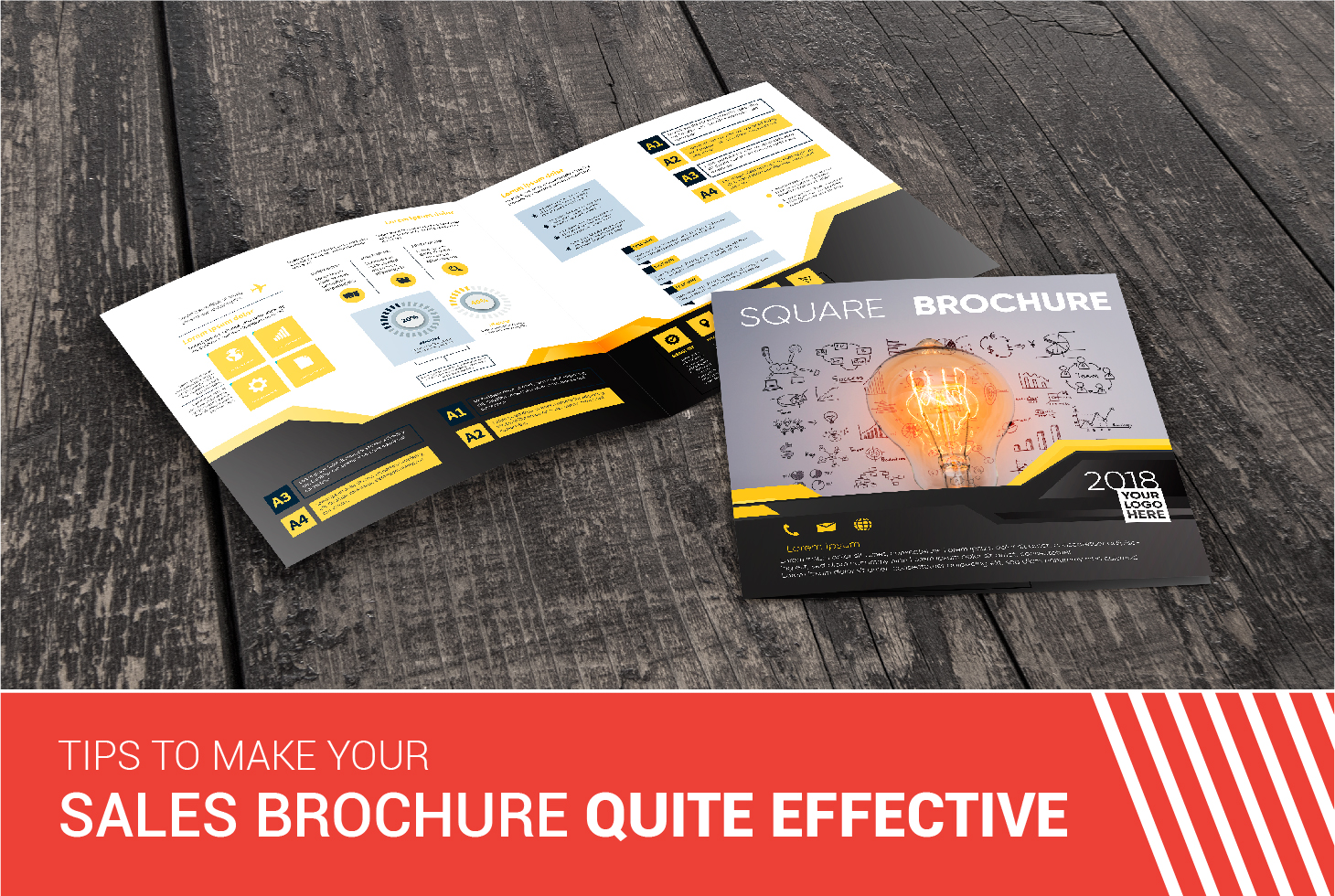
Brochures can be used for advertising your business and making people aware of it. But what should be done to make your brochure stand out from those of other companies in the market? You definitely want your brochure to dazzle, right? Because unless it is creative enough to catch anyone’s eye, the flyer will fail to drum up your business. When it is the time to announce a new product or service, the need to ensure good response crops up. Since it is not that easy to make a stunning sales brochure from scratch, you have to keep a few details in mind to do and be the best.
However, there is a significant expense involved if you want to create and mail a sales brochure. Apart from cost, there are a few other things that need to be kept in mind before sending out a brochure. Each pamphlet is like a piece of literature that creates an impact on your probable prospects. Be careful to avoid the wrong impression as one faulty step can have an effect on the customers. You run from the risk of alienating potential customers, thereby losing the sales in the process.
Hence, in order to make your flyer or brochure a winner, follow this copying and design tips:
1. NOT TELLING, BUT SELLING IS THE KEY
Nobody is interested in your company or in its growth and will only focus on their own selves and their own businesses. Hence, you need to make sure that the brochure will give them a view about the privileges they will enjoy by availing of the service or purchasing the product from you. For example, no one buys a phone just to make emergency phone calls or texts anymore. Some buy it to post pictures and thoughts on social media while some just want to show off their latest cool device to others. As a result, the mobile companies do not focus on calls anymore in their brochures. They show all the other possible things that can be done with a smartphone, starting from sharing photos on different platforms to getting adequate data allowance each month. So, before you sit down to write a copy for your sales brochure, make a rough list of all the things that your product will offer. Think of all the fun aspects and design the brochures in that way. The flashy benefits will catch the attention of the customers due to which they might acquire the interest to buy your product. Listing the benefits from beforehand will help you to make a customer-focused copy.
2. UNDERSTAND YOUR TARGETED CUSTOMERS
The very first step before proceeding with the design or the theme of your sales brochure is to understand your potential customers and their mindset. What reason would urge them to buy your product? What is the one important thing that your product will do for them? What could be the probable problems that can be solved by your product or service and would ease out the worries of the customers? If you are clueless about the answers to these questions, then know these first. Ask around to people and get an idea about the wants and desires of the customers. It is very important to talk to your salespeople and your customers. Their answers will be beneficial for you to get a clear picture of how would you set up or design your brochure and sell it effectively.
3. PLAN THE BROCHURE AS PER AIDA
It is not as difficult or twisted as it sounds! AIDA stands for Attention, Interest, Desire and Action. To put it in a nutshell, you have to plan and design the brochure that stands the test of these four criteria. For efficient effectivity, the sales brochure needs to gain the attention of the customers, get the people interested enough to go through your brochure further in detail, increase their desire for the service or the product, and convince them enough to take a specific action which could be either buying the product, calling you to get details about the product, call to make an appointment to know more about the service or visit your website. If your brochure manages to tick off these four things in a customer, then there is a fair chance that your service or product will not go in vain. Hence, design the brochure by following the rule of AIDA, and see how fruitful your attempt becomes!
4. USE GRAPHICS AND HEADLINES THAT THE AUDIENCE WILL CARE TO LOOK AT
Know that your audience does not have an ample amount of time to take a look at your brochure. Amidst his busy schedule, he will probably spare a glance at your flyer for a second – and not a nanosecond more than that – before moving onto some other thing. An average reader glances at a flyer for merely five seconds and decides whether to go through it or not. If the graphics and the headline on the cover are boring, be sure that most of your brochures will land up in dustbins! The most effective way to avoid it is to have a thorough understanding of the targeted customers’ mindset at first, and then design the brochure accordingly and professionally. The headline sure needs to be catchy, but not so twisted that it bounces off an average man’s intellect. You need to make clever uses of pictures that will make any person do a double-take to your flyer. Of course, the picture needs to have a connection with what you are selling. Just get the right headline and an apt picture, and see how your flyers draw the attention of everyone to your products in a jiffy.
5. DO NOT USE A PICTURE OF YOUR BUILDING ON THE COVER OF THE SALES BROCHURE
Everybody out there knows that you are proud of your company and the way it has grown. However, showing it off to the customers might not impress them! Having a picture of the company building might be a tad too much for anybody who is trying to get an unbiased idea about the products or the services offered. Understand that a customer does not care about how big your building is; he just needs to know if he will be getting any benefit from the product. Your brochure should only focus on those details that will show him whether it meets his ends or not. Use the space cleverly to sell the products, and convince the customers in the most enticing way. Consult with anyone who has expertise in this field and design the cover of the sales brochure accordingly. Remember that sometimes first impression can indeed be the last impression. If the customer gets pissed off at a glance by looking at the flyer, chances are that he might not even proceed to go through it further. Instead, use images that will trigger a sense of interest in your customer. Be sure to use clear images and be professional in the outlook.
You need to plan carefully about designing your brochure to make a good sale. Apart from getting great brochure designing tips, you will also get creative ideas for poster design, leaflet design, catalogue design, logo design, e-catalogue design, e-brochure design, flyer design, website design, pamphlet design and booklet design at Brochure Guru. So, stop thinking anymore and go ahead without any further ado to give your brochures the best shot.


 Email:


This is a good blog post. Please keep me informed of every post on this website.
Thank you for the appreciation! Do come back for more such content.
don’t forget a good print finish to complete the job, you want the customer to keep hold of it 🙂