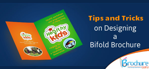
So, you think brochures are no longer relevant? Think again! Yes, agreed that everything has become digitized, but brochures are still considered as the most important lead-nurturing marketing strategy.
Think about this hypothetical situation: you attended a trade show and met a few influential people in your niche, for the very first time. During your brief meeting, you tried to learn and gather as much information about each others business, products and services, as possible. But, what happens when you part ways? A professionally designed bifold brochure will act as a reminder to all the people, who you met at the trade show, of what your business is all about and what sets you apart from your competitors. This will also entice the readers to take a look at your ‘digital platforms’, such as your website, Facebook page and so on.
Contents
- 1 Brochures are a Powerful Sales Tool
- 2 10 Tricks to Create a Memorable Brochure for Your Brand
- 2.1 # Know the objective of your brochure –
- 2.2 # Understand your target audience –
- 2.3 # Be one-of-a-kind –
- 2.4 # Restrain from going over-the-top with fonts –
- 2.5 # Avoid bombastic words –
- 2.6 # Accentuate the headline –
- 2.7 # Use relevant pictures –
- 2.8 # Pay attention to the choice of colors –
- 2.9 # Do not forget to add a call to action –
- 3 Bifold Brochure – The Most Popular Brochure Type
Brochures are a Powerful Sales Tool
Brochures have been proven to be one of the most potent sales tools. It is known to deliver a fast ROI. Industry-specific brochure designs are galore and any leading design company can help you out with it. Brochures do not magically boost sales, unlike other marketing methods, but it offers consistent results, along with the creation of brand awareness and reputation. All serious businesses, irrespective of the industry, requires brochures.
10 Tricks to Create a Memorable Brochure for Your Brand
# Know the objective of your brochure –
The brochure is going to be a form of direct communication with your audience. This makes it all the more important for you to have a clear-cut idea about what the purpose is behind designing a brochure. Is it for an event? A benefit concert? A marketing or advertising tool? A contest?
The design of the brochure is going to be based on the objective of the brochure and not the other way round!
# Understand your target audience –
As already mentioned above, brochure is a tool for communication and therefore, it is imperative that you know your customers and their needs. This way, you will be able to capture and showcase the interests of your target market in your professional brochure design. For example, are you targeting foodies? If yes, you have to choose designs, which appeal to the gastronomical delights of your core audience.
The effectiveness of a brochure is dependent on how precise you can be about the wants and needs of your audience. Now, if you are unaware of what your audience expects from you, conduct a survey to gauge customer responses and accordingly, map out the best design.
# Be one-of-a-kind –
Want to set your brand apart from your competitors? Be unique! At this age and time, creativity and exclusivity is paramount to each and every brand. Your aim should be to come up with a design, which when shuffled with other brochures on a rack, still holds out its own. For the best results, you can check out thousands of free design templates and layouts or avail the services of a renowned brochure designing company, with a team of highly-talented graphic designers.
# Restrain from going over-the-top with fonts –
It is okay to be a little excited, when designing a brochure. But, beware of going overboard. Just because there is an availability of myriad fonts, does not mean you use them all in one bifold brochure design. Use a maximum of 2 or 3 fonts, for a jazzy look. Save the rest for your next brochure.
# Avoid bombastic words –
The audience will not be impressed with fuzzy, flowery words. They will only be confused and not be able to comprehend the message you wish to communicate. The audience does not want to know that you have a great hold on vocabulary. So, refrain from using complex words and keep it simple.
# Accentuate the headline –
The headline is the hero of the brochure. The readers should instantly know what the entire brochure is about by taking one look at the headline. Do not pepper the headlines with your company’s information.
# Use relevant pictures –
Would you like to go through a boring brochure, containing only words? Of course, not! People are visual creatures and they tend to get attract to things that appear and look beautiful, interesting and fun. To make your brochure design reader-friendly, make good use of appropriate images and picture. Do avoid using generic images, as that will not create the same effect as pictures from a photoshoot or paid images.
# Pay attention to the choice of colors –
Colors can make or break your professional brochure design. Different people respond to color differently. Some may hate the sight of color, while others might pick up the brochure because of its color. If your company has a signature color, stick to it and then branch out to different tones and shades using the trademark color.
# Do not forget to add a call to action –
A brochure without a call to action will leave the audience hanging and feeling unsatisfied. The message communicated will be incomplete and the readers will be confused as to what do you want them to do, after reading the brochure. You have to encourage your readers to get in touch with you, try out your products or services or attend the concert and so on.
Bifold Brochure – The Most Popular Brochure Type
Bifold brochure is one of the most desired and preferred brochure types. These brochures can be found among us, every day. It is made out of one or more sheets of paper, which is folded in two halves. In most cases, the fold line is perpendicular to the longest side of the sheet. Out of a single sheet of paper, this folding can form up to 4 panels – a front-cover, back-cover and two internal pages.
-
The frontpanel works as the front-page of the brochure and you can use it to give a short introduction of your company or cause. You have to make sure that the front-page is designed in a way that it creates a lot of intrigue and interest, among the readers. It has to make the viewer want to open the brochure and read further.
-
The two interior panels is best used for giving information about the product offerings of your company, the event, concert or cause that you are promoting. This is where you make good use of attractive images, colors and crisp writing.
-
The back-cover is mainly reserved for call to action or contact information.
Bifold brochures are more formal, than tri-fold brochures and are best used for product presentations, formal organizations, catalogs, institutional introductions, and so on. As for trade shows, these brochures can also be made into folders and may contain pockets on the front or last inside pages.
With all the above-mentioned information and tips on how to create an attention-grabbing brochure, you no longer have any excuses not to. Investing in professional brochure design is a wise decision and it will certainly help in yielding more sales for your business. To do this the right way, hire the services of a reputed brochure design company that has its own in-house graphic designers. A custom-made brochure will be more effective than choosing a design from a free pre-made template.


 Email:


Yes I am completely agreed with you, that brochures distribution is the best way to promoting your business products into market. And thanks for guiding us and sharing the designing tips of bifold brochures.
Nice And Very useful info,
This article important and really good the for me is.Keep it up and thanks to the writer.
Oh my goodness! an amazing article dude. Thank you Nevertheless I’m experiencing problem with ur rss . Don’t know why Unable to subscribe to it. Is there anybody getting identical rss drawback? Anyone who knows kindly respond. Thnkx